Cartoon Network Watch App – Emmy Award–Winning Design (2016)
Company: Turner Broadcasting | Year: 2013-2019
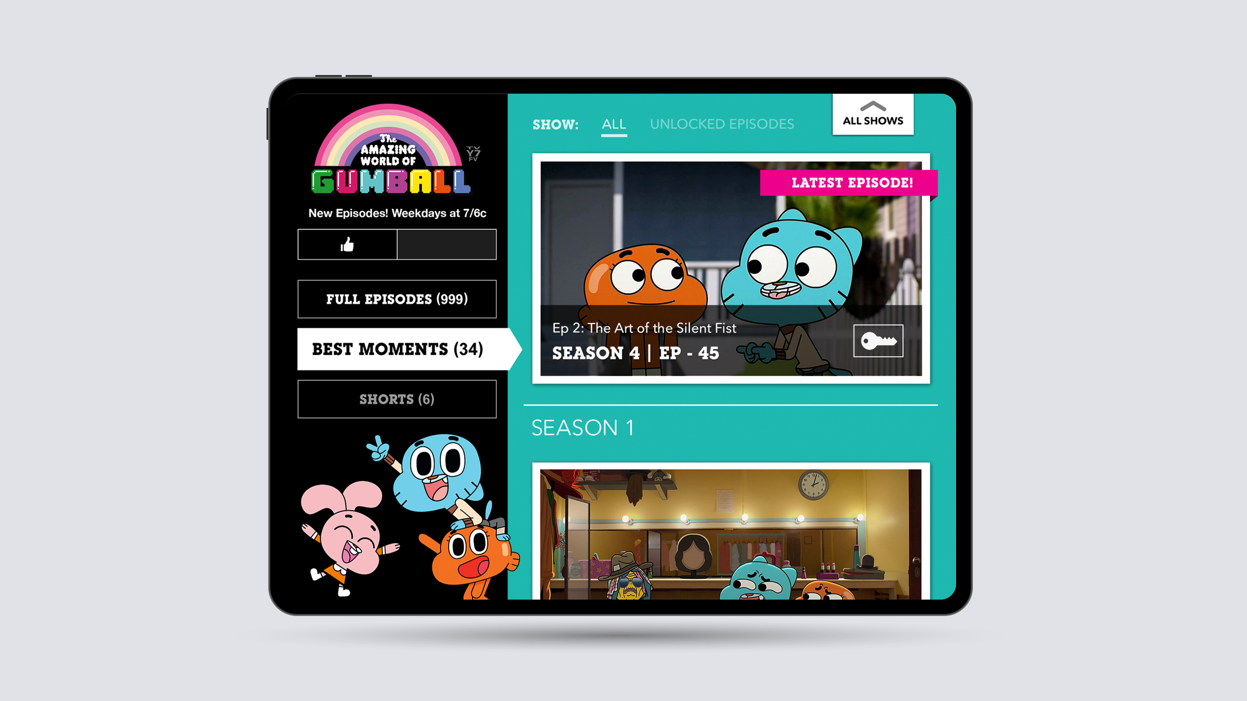
The Cartoon Network Watch app gave fans a new way to stream their favorite shows on mobile and tablet. Unlike most video apps at the time, it didn’t rely on endless grids — it was designed to feel as bold and playful as Cartoon Network itself.
In 2016, the app won an Emmy Award for Outstanding User Experience & Visual Design for reimagining what a streaming app could look and feel like.
I worked as a product designer alongside a small, collaborative team of designers, partnering with product managers, engineers, and brand stakeholders to bring the app to life.
Summarized Case Study
The Challenge
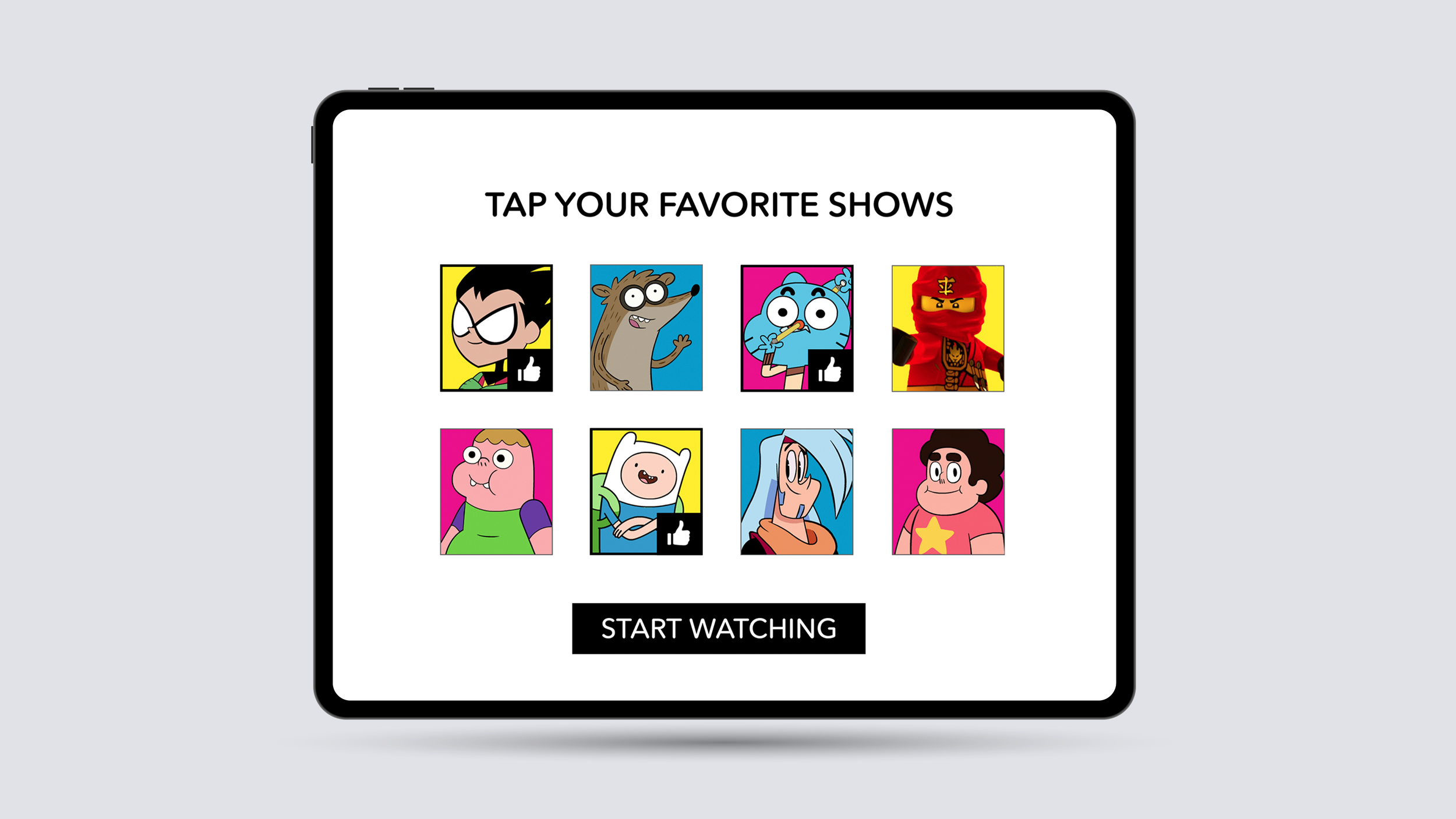
When audiences started shifting from cable to streaming, most apps gave users generic massive grids of thumbnails and forced them to pick what to watch. But that approach led to:
A dull experience for kids who are enamored by quick, colorful, and animated interfaces.
Choice paralysis, especially for kids who (often) just wanted to watch something right away. This was particularly important for a network that had several seasons of different shows and constant new episodes.
Interfaces that felt generic and uninspired.
Friction between what kids wanted (instant play) and what parents wanted (simplicity and trust).
Goals
Make an app that felt as fun and dynamic as Cartoon Network itself.
Solve for choice paralysis by creating a smarter way to start watching.
Balance kid-friendly playfulness with easy navigation for families.
Our Approach
As part of a small design team, I helped explore UI concepts on how the app could function. I also designed character-driven layouts, navigation flows, and interaction patterns.
Collaborated closely with other designers on my team and engineering to bring motion and transitions into the product so it felt alive, not static.
Partnered with brand teams to make sure the app carried Cartoon Network’s personality in every corner of the experience.
The Solution
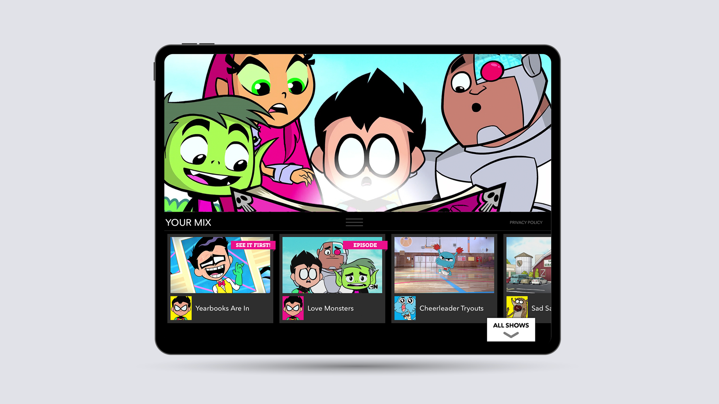
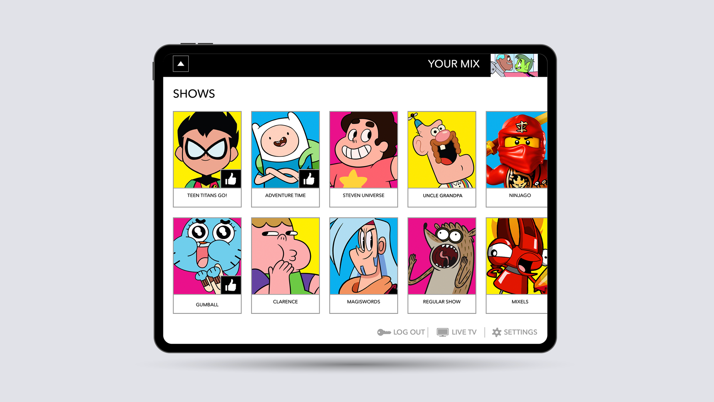
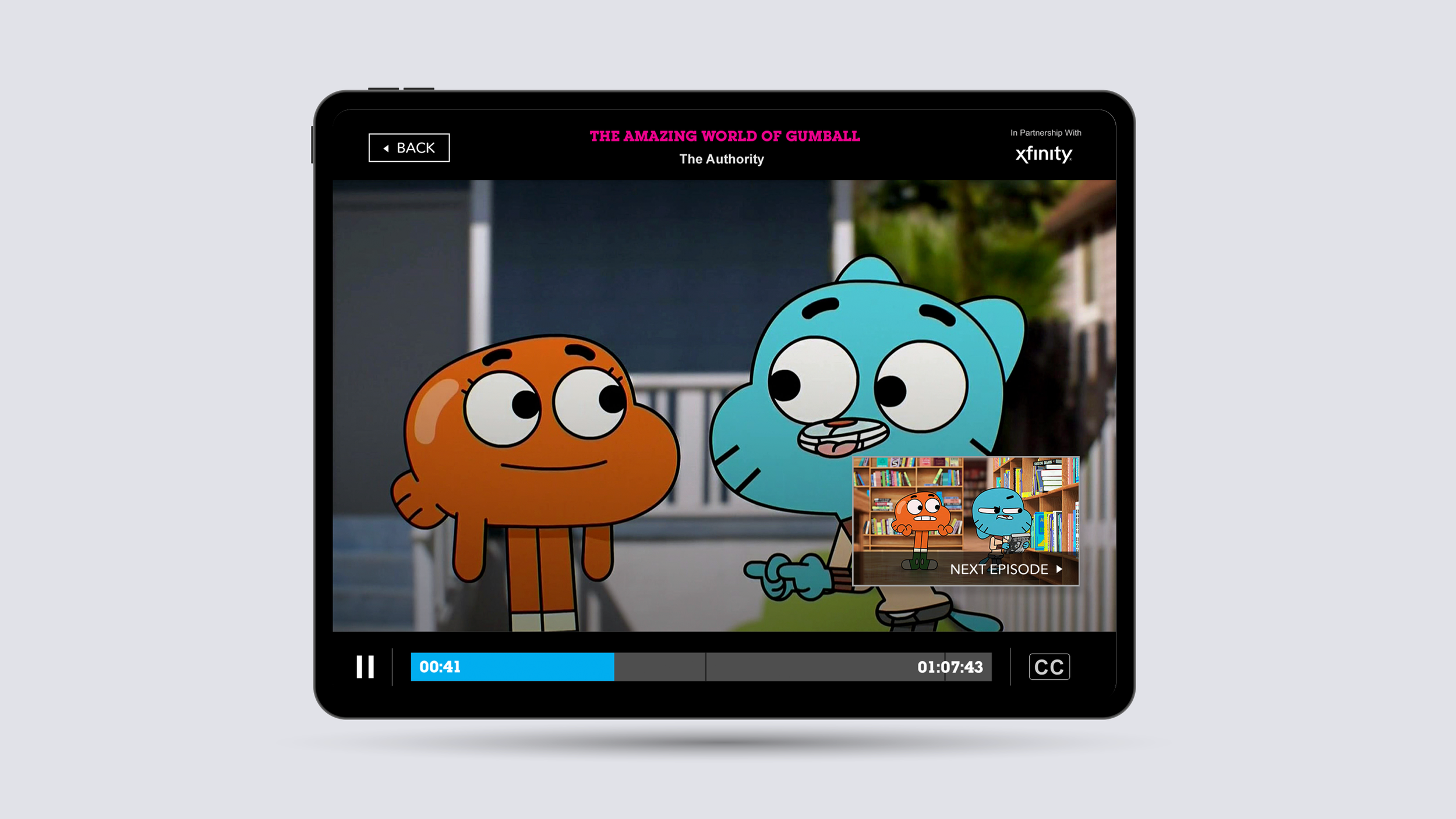
A character-led interface with bold visuals, playful color, and animation.
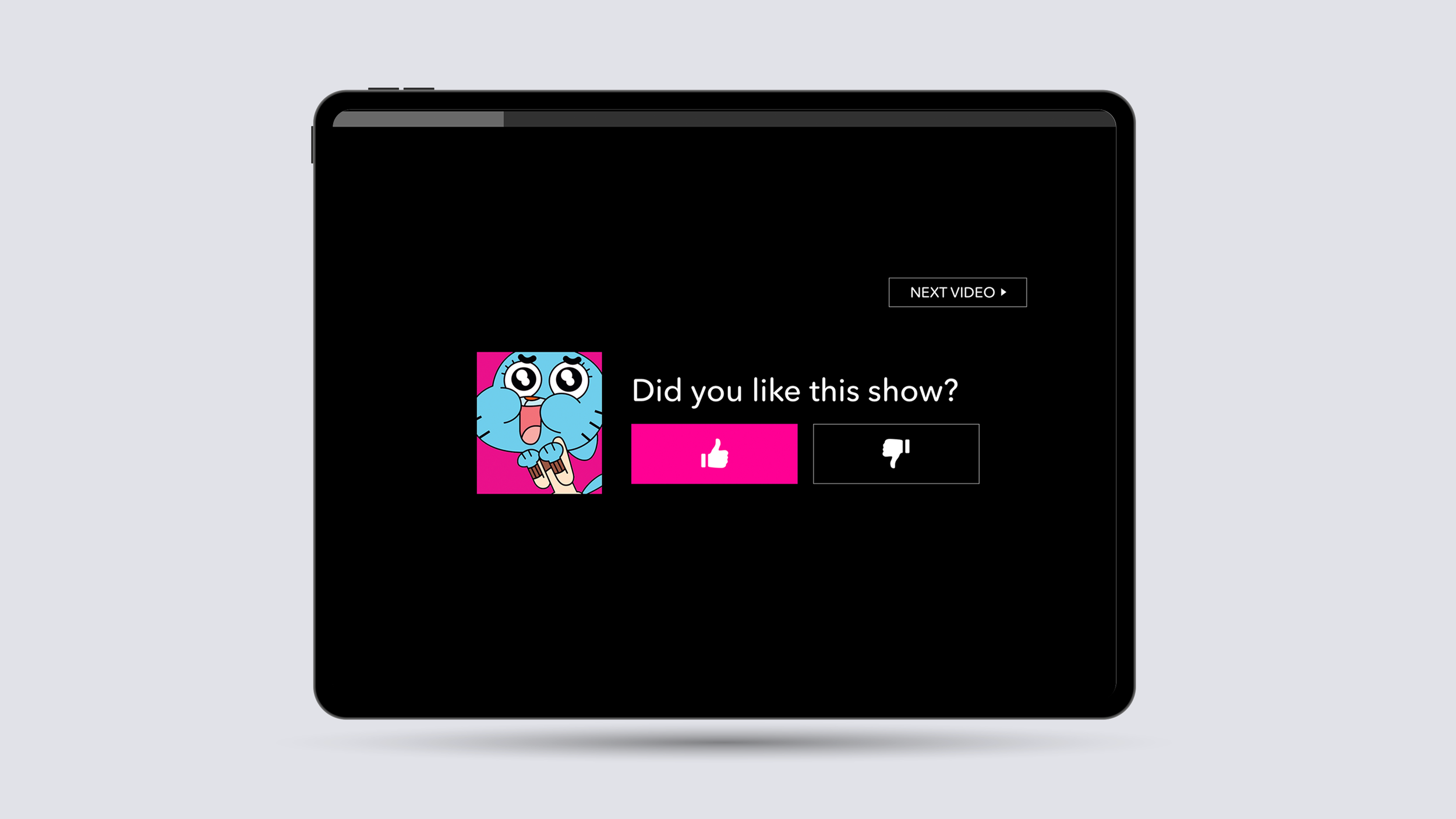
An innovative auto-play feature: instead of dropping you into a giant grid, the app would play the newest episode of a show it knew you already loved — solving choice paralysis and giving kids an instant reward.
A flexible design system that made it easy to introduce new shows, features, and network events over time.
Impact
Won the 2016 Emmy for Outstanding User Experience & Visual Design — recognized for being playful, innovative, and truly brand-driven.
Reduced friction for kids and families by making it easier to just start watching.
Set a new benchmark for how streaming apps could be both functional and delightful.
What I Learned
This project showed me the power of team collaboration — our small design group worked closely together to push past industry “norms” and create something fresh.
I also learned how important it is to design for user psychology: kids want immediate engagement, and solving for that made the app both fun and award-winning.